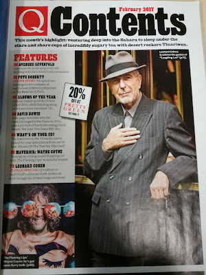
The Contents page for this magazine follows certain conventions in general however it is not entirely what general people would expect to see in a contents page. The very lay out of this Contents page goes against the normal conventions but not completely.
For example the top section of the magazine just before the 'Features' part of the magazine shows the brand identity with the 'Q' that they also showed on the front cover of the magazine. However the title of this page 'Contents' takes up a vast amount of space. Underneath it there is a small section of text that helps explain what this page is about. With normal magazines the 'Contents' part of this page would be a bit smaller to allow enough space to get more information about the pages and what they are about on this magazine.
Moving down to the middle section of this magazine the 'Features' section here it tells us about the pages and what articles are located on each individual page is the norm for a contents page. As they follow most of the conventions of magazines such as having the numbers of the pages in a different colour and having the articles in bold to help them become more noticeable for readers. Further on they yet again show the discount that are present in this magazine which the 20% off which I spoke about during the front cover analysis. Yet again they show a picture of Leonard Cohen, I think that most of this magazine was to show reference to him as he passed away in 2016 as it was shown on the front cover magazine.
With the photo of Leonard Cohen he is in a black tux and wearing a brown hat. I have already spoken about the connotations of the colour black on the front cover for this magazine. The colour brown has connotations of naturalness, neutral, warmth and honesty. These colour connotations could imply the way that Leonard Cohen lived his life and what people thought of him. With the colour black it has connotations of power responsibility and maturity, now these connotations combined with that the colour connotations of brown have a great combinations. I believe that the combinations of these 2 colours could mean that he was a powerful and honest man. Also by wearing suits it can also convey that people are of a different social standing and status than others.
At the bottom left hand corner of the contents page there is another image which is of 'The Flaming Lips'. This image consists of a Wayne Coyne with a small section that says he's got furry balls and that we should see page 68 to find out more about this. Now as this does sound strange reading this out I do believe that they used that as a way to intrigue the audience to read on for better or worse even though it does sound extremely strange to have on the contents page. Wayne Coyne on this page is covering his eyes but smiling which could be way to convey that he isn't trying to be aggressive in any sense. As with some people somewhat of making eye contact 'direct address' could be seen as a sign of aggression or intimidation.

No comments:
Post a Comment